<a href="tel:555-555-5555">Call</a> (1)
<a href="mailto:joe@example.com">Email</a> (2)In the previous chapter, we created a fully-featured native mobile version of our Contacts app. Aside from customizing the entry point URL, we didn’t need to touch any code that runs on the mobile device. We defined our mobile app’s UI and logic completely in the backend code, using Flask and HXML templates. This is possible because the standard Hyperview client supports all of the basic features by mobile apps.
But the standard Hyperview client can’t do everything out of the box. As app developers, we want apps to have unique touches like custom UIs or deep integration with platform capabilities. To support these needs, the Hyperview client was designed to be extended with custom behavior actions and UI elements. In this section, we will enhance our mobile app with examples of both.
Before diving in, let’s take a quick look at the tech stack we’ll be using. The Hyperview client is written in React Native, a popular cross-platform framework for creating mobile apps. It uses the same component-based API as React. This means developers familiar with JavaScript and React can quickly pick up React Native. React Native has a healthy ecosystem of open-source libraries. We’ll be leveraging these libraries to create our custom extensions to the Hyperview client.
Adding Phone Calls and Email
Let’s start with the most obvious feature missing from our Contacts app: phone calls. Mobile devices can make phone calls. The contacts in our app have phone numbers. Shouldn’t our app support calling those phone numbers? And while we’re at it, our app should also support e-mailing the contacts.
On the web, calling phone numbers is supported with the tel: URI scheme, and e-mails are supported with the mailto: URI scheme:
tel and mailto schemes in HTML- When clicked, prompt the user to call the given phone number
-
When clicked, open an e-mail client with the given address populated in the
to:field.
The Hyperview client doesn’t support the tel: and mailto: URI schemes.
But we can add these capabilities to the client with custom behavior actions.
Remember that behaviors are interactions defined in HXML.
Behaviors have triggers (“press”, “refresh”) and actions (“update”, “share”).
The values of “action” are not limited to the set that comes in the Hyperview library.
So let’s define two new actions, “open-phone” and “open-email”.
<view xmlns:comms="https://hypermedia.systems/hyperview/communications"> (1)
  <text>
    <behavior action="open-phone" comms:phone-number="555-555-5555" /> (2)
    Call
  </text>
  <text>
    <behavior action="open-email" comms:email-address="joe@example.com" /> (3)
    Email
  </text>
</view>- Define an alias for an XML namespace used by our new attributes.
- When pressed, prompt the user to call the given phone number.
-
When pressed, open an e-mail client with the given address populated in the
to:field.
Notice we defined the actual phone number and email address using separate attributes.
In HTML, the scheme and data are crammed into the href attribute.
HXML’s <behavior> elements give more options for representing the data.
We chose to use attributes, but we could have represented the phone number or email using child elements.
We’re also using a namespace to avoid potential future conflicts with other client extensions.
So far so good, but how does the Hyperview client know how to interpret open-phone and open-email, and how to reference the phone-number and email-address attributes?
This is where we finally need to write some JavaScript.
First, we’re going to add a 3rd-party library (react-native-communications) to our demo app.
This library provides a simple API that interacts with OS-level functionality for calls and emails.
> cd hyperview/demo
> yarn add react-native-communications (1)
> yarn start (2)-
Add dependency on
react-native-communications - Re-start the mobile app
Next, we’ll create a new file, phone.js, that will implement the code associated with the open-phone action:
import { phonecall } from 'react-native-communications'; (1)

const namespace = "https://hypermedia.systems/hyperview/communications";

export default {
  action: "open-phone", (2)
  callback: (behaviorElement) => { (3)
    const number = behaviorElement.getAttributeNS(namespace, "phone-number"); (4)
    if (number != null) {
      phonecall(number, false); (5)
    }
  },
};- Import the function we need from the 3rd party library.
- The name of the action.
- The callback that runs when the action triggers.
-
Get the phone number from the
<behavior>element. - Pass the phone number to the function from the 3rd party library.
Custom actions are defined as a JavaScript object with two keys: action and callback.
This is how the Hyperview client associates a custom action in the HXML with our custom code.
The callback value is a function that takes a single parameter, behaviorElement.
This parameter is an XML DOM representation of the <behavior> element that triggered the action.
That means we can call methods on it like getAttribute, or access attributes like childNodes.
In this case, we use getAttributeNS to read the phone number from the phone-number attribute on the <behavior> element.
If the phone number is defined on the element, we can call the phonecall() function provided by the react-native-communications library.
There’s one more thing to do before we can use our custom action: register the action with the Hyperview client.
The Hyperview client is represented as a React Native component called Hyperview.
This component takes a prop called behaviors, which is an array of custom action objects like our “open-phone” action.
Let’s pass our “open-phone” implementation to the Hyperview component in our demo app.
import React, { PureComponent } from 'react';
import Hyperview from 'hyperview';
import OpenPhone from './phone'; (1)

export default class HyperviewScreen extends PureComponent {
  // ... omitted for brevity

  behaviors = [OpenPhone]; (2)

  render() {
    return (
      <Hyperview
        behaviors={this.behaviors} (3)
        entrypointUrl={this.entrypointUrl}
        // more props...
      />
    );
  }
}- Import the open-phone action.
- Create an array of custom actions.
-
Pass the custom actions to the
Hyperviewcomponent, as a prop calledbehaviors.
Under the hood, the Hyperview component is responsible for taking HXML and turning it into mobile UI elements.
It also handles triggering behavior actions based on user interactions.
By passing the “open-phone” action to Hyperview, we can now use it as a value for the action attribute on <behavior> elements.
In fact, let’s do that now by updating the show.xml template in our Flask app:
hv/show.xml{% block content %}
<view style="details">
<text style="contact-name">{{ contact.first }} {{ contact.last }}</text>
<view style="contact-section">
<behavior (1)
xmlns:comms="https://hypermedia.systems/hyperview/communications"
trigger="press"
action="open-phone" (2)
comms:phone-number="{{contact.phone}}" (3)
/>
<text style="contact-section-label">Phone</text>
<text style="contact-section-info">{{contact.phone}}</text>
</view>
<view style="contact-section">
<behavior (4)
xmlns:comms="https://hypermedia.systems/hyperview/communications"
trigger="press"
action="open-email"
comms:email-address="{{contact.email}}"
/>
<text style="contact-section-label">Email</text>
<text style="contact-section-info">{{contact.email}}</text>
</view>
</view>
{% endblock %}- Add a behavior to the phone number section that triggers on “press.”
- Trigger the new “open-phone” action.
- Set the attribute expected by the “open-phone” action.
- Same idea, with a different action (“open-email”).
We’ll skip over the implementation of the second custom action, “open-email.”
As you can guess, this action will open a system-level email composer to let the user send an email to their contact.
The implementation of “open-email” is almost identical to “open-phone.”
The react-native-communications library exposes a function called email(), so we just wrap it and pass arguments to it in the same way.
We now have a complete example of extending the client with custom behavior actions.
We chose a new name for our actions (“open-phone” and “open-email”), and mapped those names to functions.
The functions take <behavior> elements and can run any arbitrary React Native code.
We wrapped an existing 3rd party library, and read attributes set on the <behavior> element to pass data to the library.
After re-starting our demo app, our client has new capabilities we can immediately utilize by referencing the actions from our HXML templates.
Adding Messages
The phone and email actions added in the previous section are examples of “system actions.” System actions trigger some UI or capability provided by the device’s OS. But custom actions are not limited to interacting with OS-level APIs. Remember, the callbacks that implement actions can run arbitrary code, including code that renders our own UI elements. This next custom action example will do just that: render a custom confirmation message UI element.
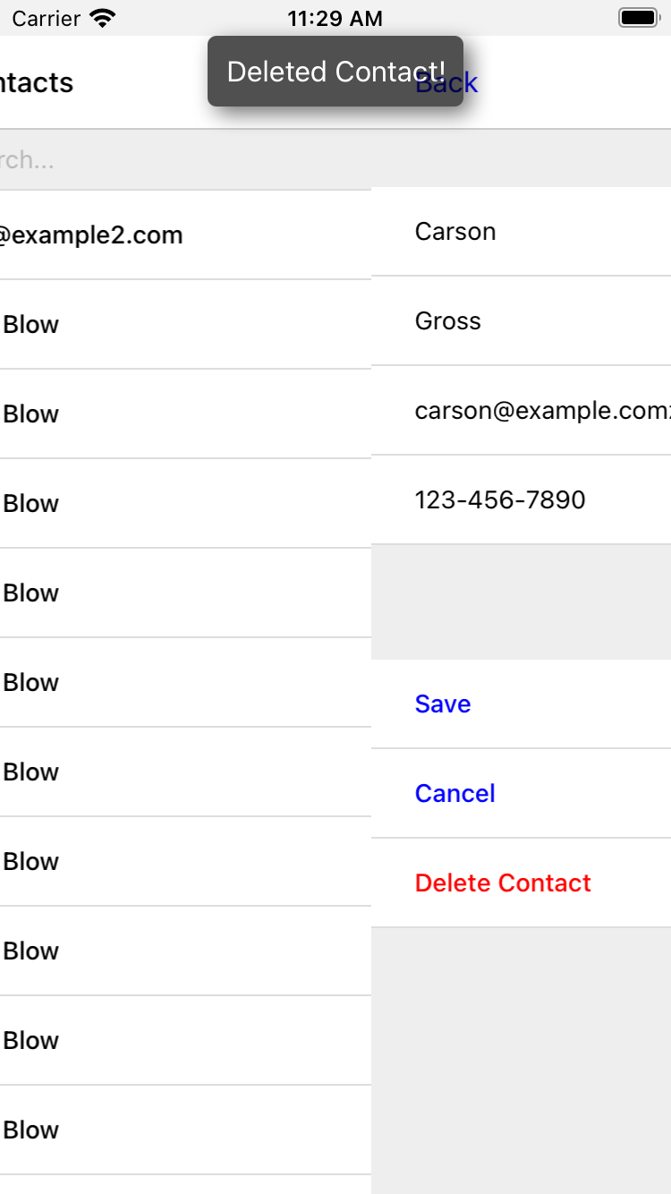
If you recall, our Contacts web app shows messages upon successful actions, such as deleting or creating a contact.
These messages are generated in the Flask backend using the flash() function, called from the views.
Then the base layout.html template renders the messages into the final web page.
{% for message in get_flashed_messages() %}
  <div class="flash">{{ message }}</div>
{% endfor %}
Our Flask app still includes the calls to flash(), but the Hyperview app is not accessing the flashed message to display to the user.
Let’s add that support now.
We could just show the messages using a similar technique to the web app: loop through the messages and render some <text> elements in layout.xml.
This approach has a major downside: the rendered messages would be tied to a specific screen.
If that screen was hidden by a navigation action, the message would be hidden too.
What we really want is for our message UI to display “above” all of the screens in the navigation stack.
That way, the message would remain visible (fading away after a few seconds), even if the stack of screens changes below.
To display some UI outside of the <screen> elements, we’re going to need to extend the Hyperview client with a new custom action, show-message.
This is another opportunity to use an open-source library, react-native-root-toast.
Let’s add this library to our demo app.
> cd hyperview/demo
> yarn add react-native-root-toast (1)
> yarn start (2)-
Add dependency on
react-native-root-toast - Re-start the mobile app
Now, we can write the code to implement the message UI as a custom action.
import Toast from 'react-native-root-toast'; (1)

const namespace = "https://hypermedia.systems/hyperview/message";

export default {
  action: "show-message", (2)
  callback: (behaviorElement) => { (3)
    const text = behaviorElement.getAttributeNS(namespace, "text");
    if (text != null) {
      Toast.show(text, {position: Toast.positions.TOP, duration: 2000}); (4)
    }
  },
};
-
Import the
ToastAPI. - The name of the action.
- The callback that runs when the action triggers.
- Pass the message to the toast library.
This code looks very similar to the implementation of open-phone.
Both callbacks follow a similar pattern: read namespaced attributes from the <behavior> element, and pass those values to a 3rd party library.
For simplicity, we’re hard-coding options to show the message at the top of the screen, fading out after 2 seconds.
But react-native-root-toast exposes many options for positioning, timing of animations, colors, and more.
We could specify these options using extra attributes on behaviorElement to make the action more configurable.
For our purposes, we will just stick to a bare-bones implementation.
Now we need to register our custom action with the <Hyperview> component, by passing it to the behaviors prop.
import React, { PureComponent } from 'react';
import Hyperview from 'hyperview';
import OpenEmail from './email';
import OpenPhone from './phone';
import ShowMessage from './message'; (1)

export default class HyperviewScreen extends PureComponent {
  // ... omitted for brevity

  behaviors = [OpenEmail, OpenPhone, ShowMessage]; (2)

  // ... omitted for brevity
}-
Import the
show-messageaction. -
Pass the action to the
Hyperviewcomponent, as a prop calledbehaviors.
All that’s left to do is trigger the show-message action from our HXML.
There are three user actions that result in showing a message:
- Creating a new contact
- Updating an existing contact
- Deleting a contact
The first two actions are implemented in our app using the same HXML template, form_fields.xml.
Upon successfully creating or updating a contact, this template will reload the screen and trigger an event, using behaviors that trigger on “load”.
The deletion action also uses behaviors that trigger on “load”, defined in the deleted.xml template.
So both form_fields.xml and deleted.xml need to be modified to also show messages on load.
Since the actual behaviors will be the same in both templates, let’s create a shared template to reuse the HXML.
{% for message in get_flashed_messages() %}
  <behavior (1)
    xmlns:message="https://hypermedia.systems/hyperview/message"
    trigger="load" (2)
    action="show-message" (3)
    message:text="{{ message }}" (4)
  />
{% endfor %}- Define a behavior for each message to display.
- Trigger this behavior as soon as the element loads.
- Trigger the new “show-message” action.
- The “show-message” action will display the flashed message in its UI.
Like in layout.html of the web app, we loop through all of the flashed messages and render some markup for each message.
However, in the web app, the message was directly rendered into the web page.
In the Hyperview app, each message is displayed using a behavior that triggers our custom UI.
Now we just need to include this template in form_fields.xml:
<view xmlns="https://hyperview.org/hyperview" style="edit-group">
  {% if saved %}
    {% include "hv/messages.xml" %} (1)
    <behavior trigger="load" once="true" action="dispatch-event" event-name="contact-updated" />
    <behavior trigger="load" once="true" action="reload" href="/contacts/{{contact.id}}" />
  {% endif %}
  <!-- omitted for brevity -->
</view>- Show the messages as soon as the screen loads.
And we can do the same thing in deleted.xml:
<view xmlns="https://hyperview.org/hyperview">
  {% include "hv/messages.xml" %} (1)
  <behavior trigger="load" action="dispatch-event" event-name="contact-updated" />
  <behavior trigger="load" action="back" />
</view>- Show the messages as soon as the screen loads.
In both form_fields.xml and deleted.xml, multiple behaviors get triggered on “load.”
In deleted.xml, we immediately navigate back to the previous screen.
In form_fields.xml, we immediately reload the current screen to show the Contact details.
If we rendered our message UI elements directly in the screen, the user would barely see them before the screen disappeared or reloaded.
By using a custom action, the message UI remains visible even while the screens change beneath them.
Swipe Gesture on Contacts
To add communication capabilities and the message UI, we extended the client with custom behavior actions. But the Hyperview client can also be extended with custom UI components that render on the screen. Custom components are implemented as React Native components. That means anything that’s possible in React Native can be done in Hyperview as well! Custom components open up endless possibilities to build rich mobile apps with the Hypermedia architecture.
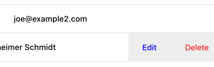
To illustrate the possibilities, we will extend the Hyperview client in our mobile app to add a “swipeable row” component. How does it work? The “swipeable row” component supports a horizontal swiping gesture. As the user swipes this component from right to left, the component will slide over, revealing a series of action buttons. Each action button will be able to trigger standard Hyperview behaviors when pressed. We will use this custom component in our Contacts List screen. Each contact item will be a “swipeable row”, and the actions will give quick access to edit and delete actions for the contact.
Designing The Component
Rather than implementing the swipe gesture from scratch, we will once again use an open-source third-party library: react-native-swipeable.
> cd hyperview/demo
> yarn add react-native-swipeable (1)
> yarn start (2)-
Add dependency on
react-native-swipeable. - Re-start the mobile app.
This library provides a React Native component called Swipeable.
It can render any React Native components as its main content (the part that can be swiped).
It also takes an array of React Native components as a prop to render as the action buttons.
When designing a custom component, we like to define the HXML of the component before writing the code. This way, we can make sure the markup is expressive but succinct, and will work with the underlying library.
For the swipeable row, we need a way to represent the entire component, the main content, and one of many buttons.
<swipe:row xmlns:swipe="https://hypermedia.systems/hyperview/swipeable"> (1)
  <swipe:main> (2)
    <!-- main content shown here -->
  </swipe:main>

  <swipe:button> (3)
    <!-- first button that appears when swiping -->
  </swipe:button>

  <swipe:button> (4)
    <!-- second button that appears when swiping -->
  </swipe:button>
</swipe:row>- Parent element encapsulating the entire swipeable row, with custom namespace.
- The main content of the swipeable row, can hold any HXML.
- The first button that appears when swiping, can hold any HXML.
- The second button that appears when swiping, can hold any HXML.
This structure clearly separates the main content from the buttons. It also supports one, two, or more buttons. Buttons appear in the order of definition, making it easy to swap the order.
This design covers everything we need to implement a swipeable row for our contacts list. But it’s also generic enough to be reusable. The previous markup contains nothing specific to the contact name, editing the contact, or deleting the contact. If later we add another list screen to our app, we can use this component to make the items in that list swipeable.
Implementing The Component
Now that we know the HXML structure of our custom component, we can write the code to implement it. What does that code look like? Hyperview components are written as React Native components. These React Native components are mapped to a unique XML namespace and tag name. When the Hyperview client encounters that namespace and tag name in the HXML, it delegates rendering of the HXML element to the matching React Native component. As part of delegation, the Hyperview Client passes several props to the React Native component:
-
element: The XML DOM element that maps to the React Native component. -
stylesheets: The styles defined in the<screen>. -
onUpdate: The function to call when the component triggers a behavior. -
option: Miscellaneous settings used by the Hyperview client.
Our swipeable row component is a container with slots to render arbitrary main content and buttons.
That means it needs to delegate back to the Hyperview client to render those parts of the UI.
This is done with a public function exposed by the Hyperview client, Hyperview.renderChildren().
Now that we know how custom Hyperview components are implemented, let’s write the code for our swipeable row.
import React, { PureComponent } from 'react';
import Hyperview from 'hyperview';
import Swipeable from 'react-native-swipeable';

const NAMESPACE_URI = 'https://hypermedia.systems/hyperview/swipeable';

export default class SwipeableRow extends PureComponent { (1)
  static namespaceURI = NAMESPACE_URI; (2)
  static localName = "row"; (3)

  getElements = (tagName) => {
    return Array.from(this.props.element.getElementsByTagNameNS(NAMESPACE_URI, tagName));
  };

  getButtons = () => { (4)
    return this.getElements("button").map((buttonElement) => {
      return Hyperview.renderChildren(buttonElement, this.props.stylesheets, this.props.onUpdate, this.props.options); (5)
    });
  };

  render() {
    const [main] = this.getElements("main");
    if (!main) {
      return null;
    }

    return (
      <Swipeable rightButtons={this.getButtons()}> (6)
        {Hyperview.renderChildren(main, this.props.stylesheets, this.props.onUpdate, this.props.options)} (7)
      </Swipeable>
    );
  }
}- Class-based React Native component.
- Map this component to the given HXML namespace.
- Map this component to the given HXML tag name.
-
Function that returns an array of React Native components for each
<button>element. - Delegate to the Hyperview client to render each button.
- Pass the buttons and main content to the third-party library.
- Delegate to the Hyperview client to render the main content.
The SwipeableRow class implements a React Native component.
At the top of the class, we set a static namespaceURI property and localName property.
These properties map the React Native component to a unique namespace and tag name pair in the HXML.
This is how the Hyperview client knows to delegate to SwipeableRow when encountering custom elements in the HXML.
At the bottom of the class, you’ll see a render() method.
render() gets called by React Native to return the rendered component.
Since React Native is built on the principle of composition, render() typically returns a composition of other React Native components.
In this case, we return the Swipeable component (provided by the react-native-swipeable library), composed with React Native components for the buttons and main content.
The React Native components for the buttons and main content are created using a similar process:
-
Find the specific child elements (
<button>or<main>). -
Turn those elements into React Native components using
Hyperview.renderChildren(). -
Set the components as children or props of
Swipeable.

This code may be hard to follow if you’ve never worked with React or React Native. That’s OK. The important takeaway is: we can write code to translate arbitrary HXML into React Native components. The structure of the HXML (both attributes and elements) can be used to represent multiple facets of the UI (in this case, the buttons and main content). Finally, the code can delegate rendering of child components back to the Hyperview client.
The result: this swipeable row component is completely generic. The actual structure and styling and interactions of the main content and buttons can be defined in the HXML. Creating a generic component means we can reuse it across multiple screens for different purposes. If we add more custom components or new behavior actions in the future, they will work with our swipeable row implementation.
The last thing to do is register this new component with the Hyperview client.
The process is similar to registering custom actions.
Custom components are passed as a separate components prop to the Hyperview component.
import React, { PureComponent } from 'react';
import Hyperview from 'hyperview';
import OpenEmail from './email';
import OpenPhone from './phone';
import ShowMessage from './message';
import SwipeableRow from './swipeable'; (1)

export default class HyperviewScreen extends PureComponent {
  // ... omitted for brevity

  behaviors = [OpenEmail, OpenPhone, ShowMessage];
  components = [SwipeableRow]; (2)

  render() {
    return (
      <Hyperview
        behaviors={this.behaviors}
        components={this.components} (3)
        entrypointUrl={this.entrypointUrl}
        // more props...
      />
    );
  }
}-
Import the
SwipeableRowcomponent. - Create an array of custom components.
-
Pass the custom component to the
Hyperviewcomponent, as a prop calledcomponents.
We’re now ready to update our HXML templates to make use of the new swipeable row component.
Using the component
Currently, the HXML for a contact item in the list consists of a <behavior> and <text> element:
hv/rows.xml<item key="{{ contact.id }}" style="contact-item">
<behavior trigger="press" action="push" href="/contacts/{{ contact.id }}" /> (1)
<text style="contact-item-label">
<!-- omitted for brevity -->
</text>
</item>With our swipeable row component, this markup will become the “main” UI.
So let’s start by adding <row> and <main> as parent elements.
hv/rows.xml<item key="{{ contact.id }}">
<swipe:row xmlns:swipe="https://hypermedia.systems/hyperview/swipeable"> (1)
<swipe:main> (2)
<view style="contact-item"> (3)
<behavior trigger="press" action="push" href="/contacts/{{ contact.id }}" /> (1)
<text style="contact-item-label">
<!-- omitted for brevity -->
</text>
</view>
</swipe:main>
</swipe:row>
</item>-
Added
<swipe:row>parent element, with namespace alias forswipe. -
Added
<swipe:main>element to define the main content. -
Wrapped the existing
<behavior>and<text>elements in a<view>.
Previously, the contact-item style was set on the <item> element.
That made sense when the <item> element was the container for the main content of the list item.
Now that the main content is a child of <swipe:main>, we need to introduce a new <view> where we apply the styles.
If we reload our backend and mobile app, you won’t experience any changes on the Contacts List screen yet. Without any action buttons defined, there’s nothing to reveal when swiping a row. Let’s add two buttons to the swipeable row.
hv/rows.xml<item key="{{ contact.id }}">
<swipe:row xmlns:swipe="https://hypermedia.systems/hyperview/swipeable">
<swipe:main>
<!-- omitted for brevity -->
</swipe:main>
<swipe:button> (1)
<view style="swipe-button">
<text style="button-label">Edit</text>
</view>
</swipe:button>
<swipe:button> (2)
<view style="swipe-button">
<text style="button-label-delete">Delete</text>
</view>
</swipe:button>
</swipe:row>
</item>-
Added
<swipe:button>for edit action. -
Added
<swipe:button>for delete action.
Now if we use our mobile app, we can see the swipeable row in action! As you swipe the contact item, the “Edit” and “Delete” buttons reveal themselves. But they don’t do anything yet. We need to add some behaviors to these buttons. The “Edit” button is straight-forward: pressing it should open the contact details screen in edit mode.
hv/rows.xml<swipe:button>
<view style="swipe-button">
<behavior trigger="press" action="push" href="/contacts/{{ contact.id }}/edit" /> (1)
<text style="button-label">Edit</text>
</view>
</swipe:button>- When pressed, push a new screen with the Edit Contact UI.
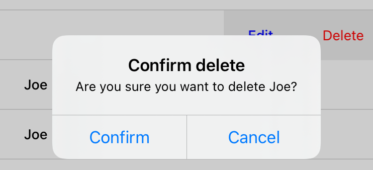
The “Delete” button is a bit more complicated.
There’s no screen to open for deletion, so what should happen when the user presses this button?
Perhaps we use the same interaction as the “Delete” button on the Edit Contact screen.
That interaction brings up a system dialog, asking the user to confirm the deletion.
If the user confirms, the Hyperview client makes a POST request to /contacts/<contact_id>/delete, and appends the response to the screen.
The response triggers a few behaviors immediately to reload the contacts list and show a message.
This interaction will work for our action button as well:
hv/rows.xml<swipe:button>
<view style="swipe-button">
<behavior (1)
xmlns:alert="https://hyperview.org/hyperview-alert"
trigger="press"
action="alert"
alert:title="Confirm delete"
alert:message="Are you sure you want to delete {{ contact.first }}?"
>
<alert:option alert:label="Confirm">
<behavior (2)
trigger="press"
action="append"
target="item-{{ contact.id }}"
href="/contacts/{{ contact.id }}/delete"
verb="post"
/>
</alert:option>
<alert:option alert:label="Cancel" />
</behavior>
<text style="button-label-delete">Delete</text>
</view>
</swipe:button>- When pressed, open a system dialog box asking the user to confirm the action.
-
If confirmed, make a POST request to the deletion endpoint, and append the response to the parent
<item>.
Now when we press “Delete,” we get the confirmation dialog as expected. After pressing confirm, the backend response triggers behaviors that show a confirmation message and reload the list of contacts. The item for the deleted contact disappears from the list.
Notice that the action buttons are able to support any type of behavior action, from push to alert.
If we wanted to, we could have the action buttons trigger our custom actions, like open-phone and open-email.
Custom components and actions can be mixed freely with the standard components and actions that come standard with the Hyperview framework.
This makes the extensions to the Hyperview client feel like first-class features.
In fact, we’ll let you in on a secret.
Within the Hyperview client, standard components and actions are implemented the same way as custom components and actions!
The rendering code does not treat <view> differently from <swipe:row>.
The behavior code does not treat alert differently from open-phone.
They are both implemented using the same techniques described in this section.
Standard components and actions are just the ones that are universally needed by all mobile apps.
But they are just the starting point.
Most mobile apps will require some extensions to the Hyperview client to deliver a great user experience. Extensions evolve the client from being a generic “Hyperview client,” to being a purpose-built client for your app. And importantly, this evolution preserves the Hypermedia, server-driven architecture and all of its benefits.
Mobile Hypermedia-Driven Applications
That concludes our build of mobile Contact.app. Step back from the code details and consider the broader pattern:
- The core logic of the app resides on the server.
- Server-rendered templates power both the web and mobile apps.
- Platform customizations are done through scripting on the web, and client customization on mobile.
The Hypermedia-Driven Application architecture allowed for significant code reuse and a manageable tech stack. Ongoing app updates and maintenance for both web and mobile can be done at the same time.
Yes, there is a story for Hypermedia-Driven Applications on mobile.